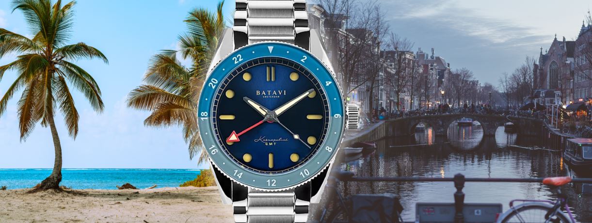
The Kosmopoliet’s unusual design is stuck between two worlds but offers real fun and wearability.

To me, the GMT is the most emotionally loaded complication of them all. Ever since the release of the Rolex 6542, and its lightning-in-a-bottle combination of sporty aesthetics, bright, cheeky primary colours and the functional ability to look down at your wrist and feel one step closer to “home” wherever in the world you may be, a GMT complication has become a kind of canned whimsy for watch brands.
The 6542 was the wide-eyed abandon of the International Geophysical Year condensed into a single piece of design history- there’s a certain cruel irony to the way that we in the 21st century, now merely haunted by lost futures and increasingly unable to envision our own, cling to objects like it. In any case, I see GMT watches as the ideal platform for brands to indulge in a little hopeful extravagance- which brings us quite neatly to the watch I’ve been wearing for the last couple of weeks, the Batavi Kosmopoliet.
Batavi is an Amsterdam-based startup who have been kicking around for a couple of years. Very much positioning themselves as a boutique entity, with an appointment-only atelier store in the city, polished wooden boxes for their products and a marketing aesthetic strongly pushing an air of sophistication, founder Ugur Mamak clearly has no shortage of ambition and underdog mentality- indeed, his decision to name his company after a Germanic tribe who took on the invading Roman empire in a last-ditch resistance in 69AD, seems to be pretty telling.
The Kosmopoliet is a noticeable step up from the less refined Noordzee design (left)

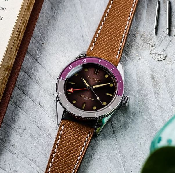
The Kosmopoliet is ostensibly the first Batavi watch, but it’s, in fact, a follow-up to the Noordzee, which was a diver that hit vaguely similar notes to the smash-hit Baltic Aquascaphe. The Noordzee seems to have been largely scrubbed from the internet (like the Kosmopoliet, it was Kickstarter-backed, so perhaps there was a funding issue there), but what pictures remain offer an interesting insight into how Batavi have developed their design language. The markers, liberal use of vintage-toned Super-LumiNova C3 and skinny bezels have all been carried over onto the Kosmopoliet, which by comparison offers a far more eye-catching and unique application of these elements. We’re arguably at peak diver saturation (pun, I’m sorry to say, intended) and wading into the vintage-inspired waters of Baltic is a dangerous game for any microbrand. The design of the Kosmopoliet, with its slew of colour options and relative sense of levity, seems to be a savvy acknowledgement of this. Scrolling through Instagram, the pink-and-blue “Medina” edition of the watch immediately caught my eye; and, based on the enthusiastic responses from other users and the rapid success of its Kickstarter campaign, I was far from alone.


My two weeks with this watch were interesting, to say the least. Upon receiving the “Amsterdam” variant and seeing it in the metal for the first time, my first reaction was…mixed. Batavi have explicitly positioned the Kosmopoliet as a “dressy” and “minimalist” piece, with stern-faced branding and a high-drama video ad campaign. What I received, however, was an eccentric and brash amalgamation of conflicting elements that baffled me.
On the dial, Christopher Ward-esque cutaway markers revealed craters of yellow fauxtina, in a sea of sunburst blue where 4 rows of differing typefaces waged war, while a bright red GMT hand orbited above- surrounding it all, two different shades of blue, a shiny scratch-magnet of a polished case, and a bracelet with [checks notes] polished sidelinks? The sheer amount of visual and textural information simultaneously attacking my brain was giving me a migraine, and questions abounded. Was this truly “Dutch minimalism”? What was I missing? How did any of this even happen?
The Kosmopoliet is a lot to look at- particularly on the bracelet.
Interestingly, my crisis was short-lived. The explosion of scorching summer weather Edinburgh has enjoyed for the last couple of weeks was a total revelation for my experience with the Kosmopoliet. On my daily quarantine walk one day, I looked down at my wrist and went: “damn, you know what, this thing POPS”. On a sleeveless arm, worn just a little loose, with the clear blue sky blasting off the sunburst dial, the whole package came together to exude a quintessentially casual summer sports watch look that blindsided me. Friends who ordinarily couldn’t give less of a f*** about what was on my wrist went “here, that looks nice, I like the blue” from 2 metres away as we sat on the grass in Princes Street Gardens. Suddenly, I got it.. Divorced from any pretensions and preconceptions, the watch’s brash design took a whole new, classically-blingy swagger.
This raises an interesting talking point about intention and perception. Batavi may earnestly believe that the Kosmopoliet is clearly a dressy, minimalist GMT, but from my perspective as a consumer this is no Grand Seiko SBGJ203, nor is it a Zenith Dual Time. Rather, the Kosmopoliet in practice taps into a cheeky, funky, flamboyant air of exuberance, bolstered by the jet-setting sense of abandon inherent to any GMT watch. It’s the horological equivalent of a replica Eames Hang it all, or a Todd Terje album. Succeeding in its quasi-vintage intentions, it evokes ambiguous retro- you’re not specifically transported to the cockpit of a 50s Pan Am flight, or into the body of a coked-out Concorde pilot, passing out in an 80s airport bar with a two-tone Root Beer hanging from your wrist; but there’s a bit of debauched thrill being loosely adapted from both. It’s actually dead cool. The lightness of its case and bracelet, the collision of its various colours, shades, textures and typefaces- it’s all part of “the vibe” when you think about it.
The straight-faced drama of Batavi’s video ads seem incongruous with the Kosmopoliet’s flamboyant charm.
So, where does this actually leave us? Well, imagine for a second that you’re walking into a gallery, and you see a fascinating, Pollock-esque canvas of abstract drip painting. Some chud behind you goes “lol, it’s just a bunch of squiggles”, but you know better. You see the woman wading into the river, you see the sunrise bathing her in light, and the promise of rebirth; you feel her determination to journey onwards, with perhaps just a hint of trepidation. It’s profound. Then, from the corner of the room, the artist themselves steps forward, and proudly declares that the piece is in fact just a macro shot of his scrotum.
Who is right?
Who is wrong?
The answer, as far as I’m concerned, is “everyone” and “no-one”. Such is modern art, and you’d better believe that watches, the peculiar intersections of art, design, engineering and fashion we occupy so much of our time with, are no different. However, one can still reconcile the sheer subjectivity of it all with the more coldly pragmatic requirement of marketing to just choose a f***ing narrative already, and I feel like Batavi could be spinning the Kosmopoliet in an entirely different way to better communicate its numerous USPs.
Far be it from me to tell any business how to market their product- my god, I’m an idiot- but I can’t help but think there’s a trick being missed. For instance, purely anecdotally: I don’t remember the last time I saw a Skagen in the wild that wasn’t a blue or red edition of their wildly popular Kulor series. Even if these people knew that Stowa exists, they wouldn’t have changed their mind when making the purchase: people love the expressiveness of bold colours, and I feel like higher-end watch brands are often too concerned with highly subjective notions of “tastefulness” and traditional masculinity to outright indulge them.
Batavi, however, has careered into this niche with a strong, versatile product that has no shortage of swagger, and certainly no shortage of colour options that cater for all genders and personalities. This, to me, is a potential goldmine- rather than arguably dissonant marketing campaigns that purely emphasize sophistication and stern-faced 2010s coffee shop hipster chic, I’d be fascinated to see Batavi really unleash the beast, and position the Kosmopoliet GMT as the vibrant, Instagram-friendly summer watch that you need to have. There’s a very real audience out there for such a thing, I reckon, and the success that the watch has enjoyed so far may be the tip of the iceberg.

I’m going to be keeping a close eye on where Batavi go from here. In the end, I had a tonne of fun with the Kosmopoliet GMT, and though I’d still be interested to see the design go through further processes of refinement, I certainly “get” it a lot more than I did when I first put it on my wrist. It’s fun and audacious, with pitch-perfect wearing proportions and colour combinations that make it a versatile choice. If you want a funky, affordable summer treat for days spent lounging in the park or by the pool, give Batavi some consideration.
The Batavi Kosmopoliet GMT is currently retailing at 609 or 679 EUR, depending on whether you purchase the Soprod C125 or ETA 2893-2 -powered version of each colour variant. The motivation for this somewhat tenuous movement distinction is unclear, and may be linked to issues with ETA availability, but I recommend the ETA variant while they’re still available. Its stainless steel case measures 39mm x 12.5mm, and is water-resistant to 200 metres. See www.batavi-watches.com for additional info.
Edwin McLachlan

Edwin McLachlan is a musician and audio engineer based in Edinburgh’s bustling city centre, with a particular fondness for Soviet, Chinese and Japanese watchmakers. You can Instagram him at @edwin_mclachlan, and work with him at www.edwinmclachlan.com.


